
As the head of design at Acoustic, I had the unique opportunity to establish a world-class design organization from the ground up. Debuting in April 2019, Acoustic emerged from IBM’s Marketing and Commerce software portfolio as an independent company backed by private equity firm, Centerbridge Partners. It was an established business with thousands of clients globally and employees around the world, but operating as a brand-new organization focused on disrupting the market.
I led a team of 50 UX designers, researchers, writers and front end developers. In a little more than a year’s time, we set up all new tooling, processes and resources; as well as embarked on a mission to fully modernize a set of complementary, yet unique marketing offerings into a seamless platform.
Client
Acoustic
Date
2019-2021
Problem statement + Vision
Our marketing and analytics portfolio was a series of siloed capabilities, reflective of their origin as different (aquired) software applications. The UI lacked modernization and workflows were seen as cumbersome. Poor usability was cited as our #1 pain point.
As-is for marketing platform
To secure the right level of investment and support for this effort we needed to sell our executive leadership team and board on the business value on the effort. To do this, I designed an end-to-end story that exemplified what could be if we were to rewrite all of our offerings as a seamless, modernized platform. It turns out that this vision story has also been extremely valuable for attracting and retaining customers and has been used by multiple functions within our organization to point to where we are going with our Marketing platform. (Note: The actual demo is an animated keynote presented without the call-outs.)
Outcomes
- A single, beautiful, well-executed design system that ensured consistency in branding, language and interactions.
- Capabilities that are easy to use with clear direction and obvious feedback.
- A simplified navigation across all products.
- Alignment for common experiences including login, user/subscription management, user profile, first use, billing, usage, and search.
- An experience that is accessible, globalized, mobile responsive, and optimized for all modern browsers.
- A better understanding of customer usage/feedback with a common metrics tagging strategy, and new NPS tooling.
- Greater development + design efficiency and velocity with reusable components built on a common frontend framework.
Phase 1: Foundation + Design system
In order to establish a brand new design system we started by cataloguing every page, modal, and action across our existing products. We then took a very atomic approach by identifying all the common atoms, molecules, organisms, templates, and pages that comprised our UI. Using the Carbon design language as our baseline we extended this open source design system to incorporate our branding, as well as designed and developed unique components, common patterns, and templates used specifically in our platform. We incorporated our own color palette and designed unique illustrations to infuse the right personality into our new experience.
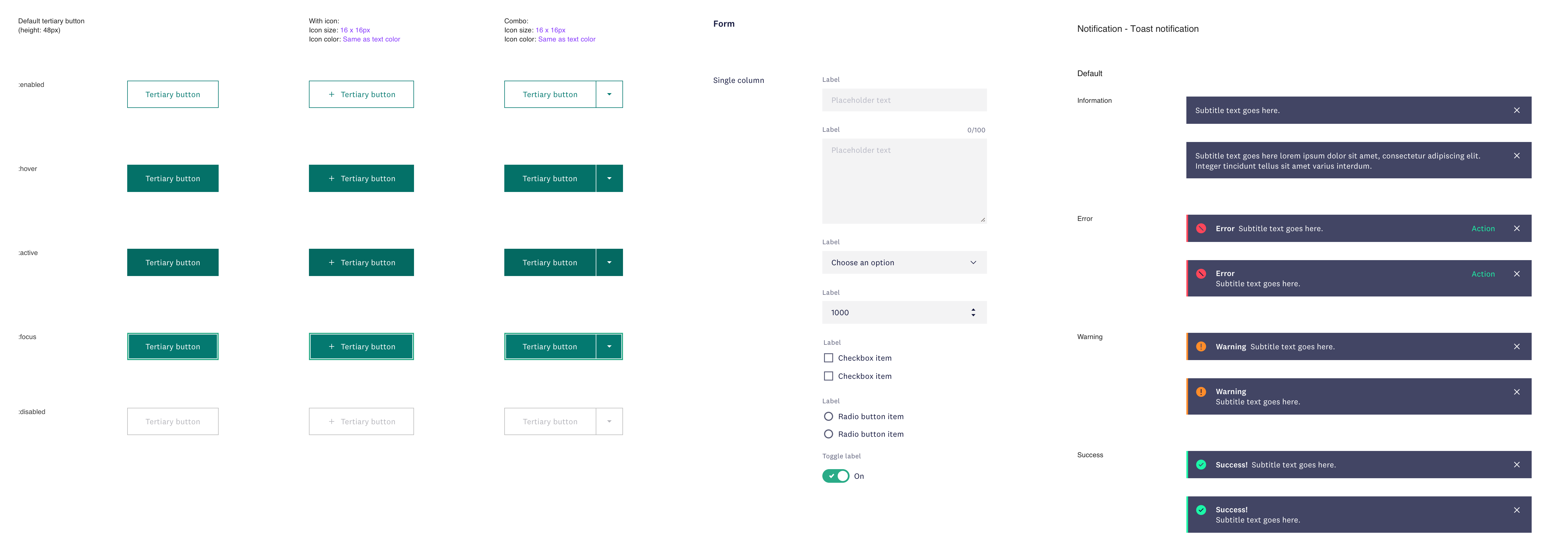
Examples of atoms in new design system
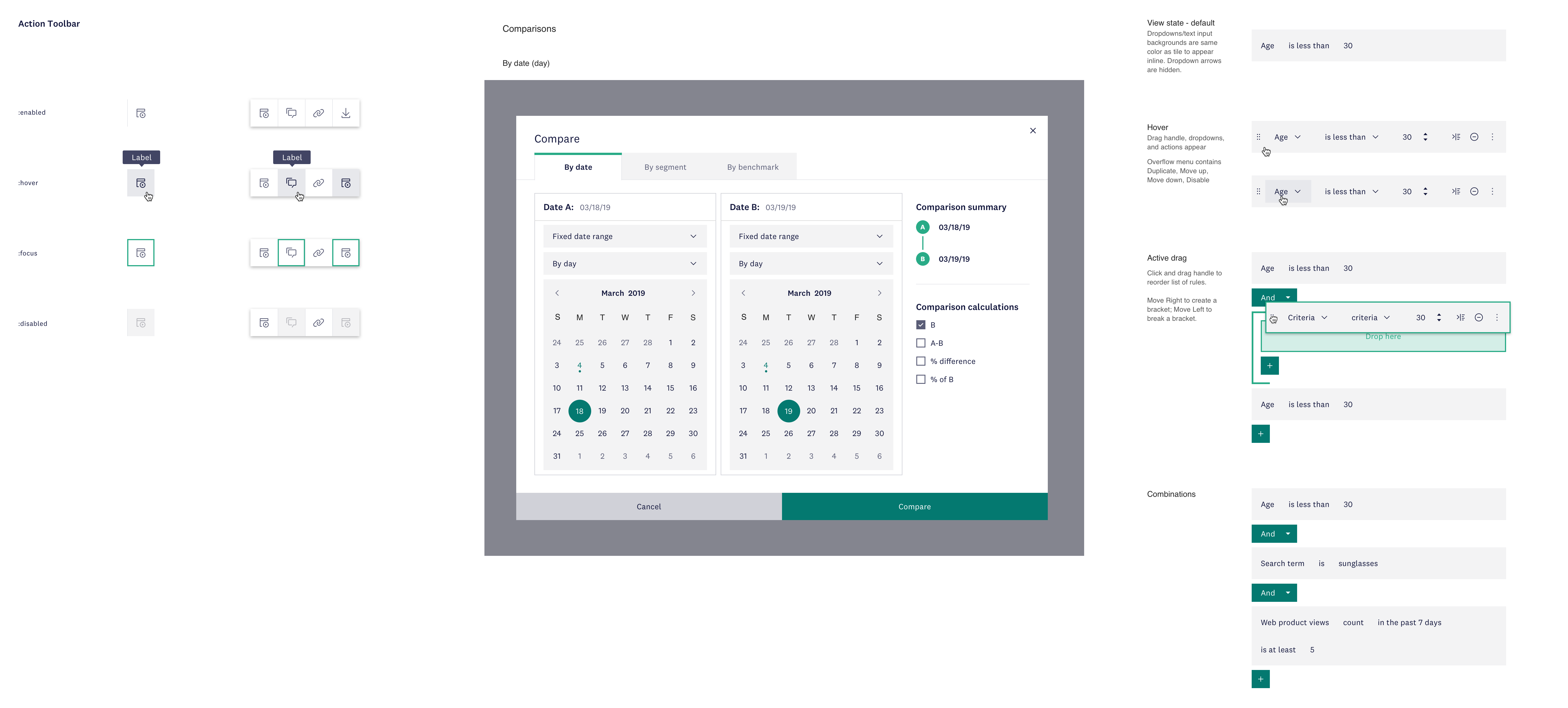
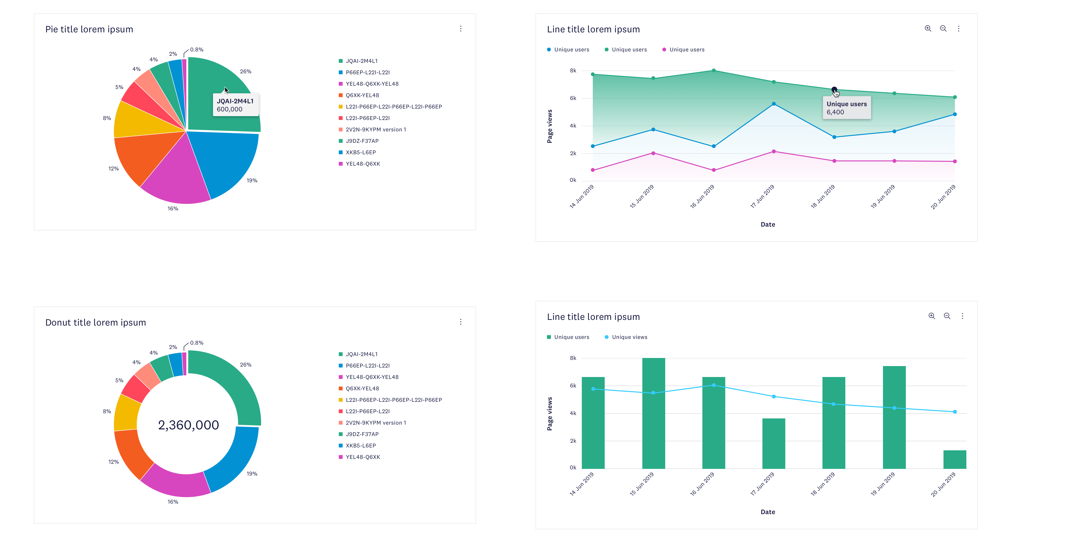
Examples of organisms in new design system
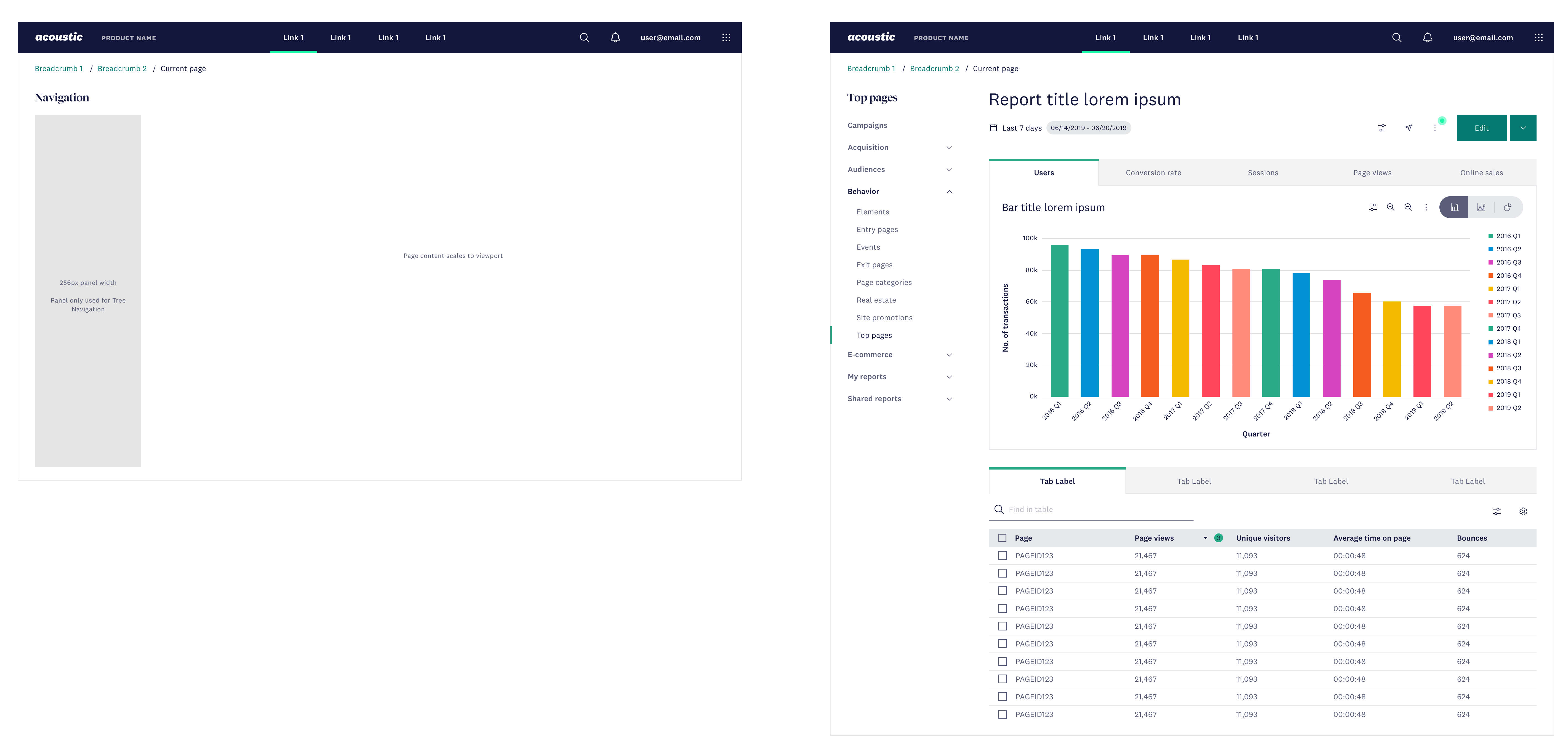
Example of how a page template maps to an actual page design
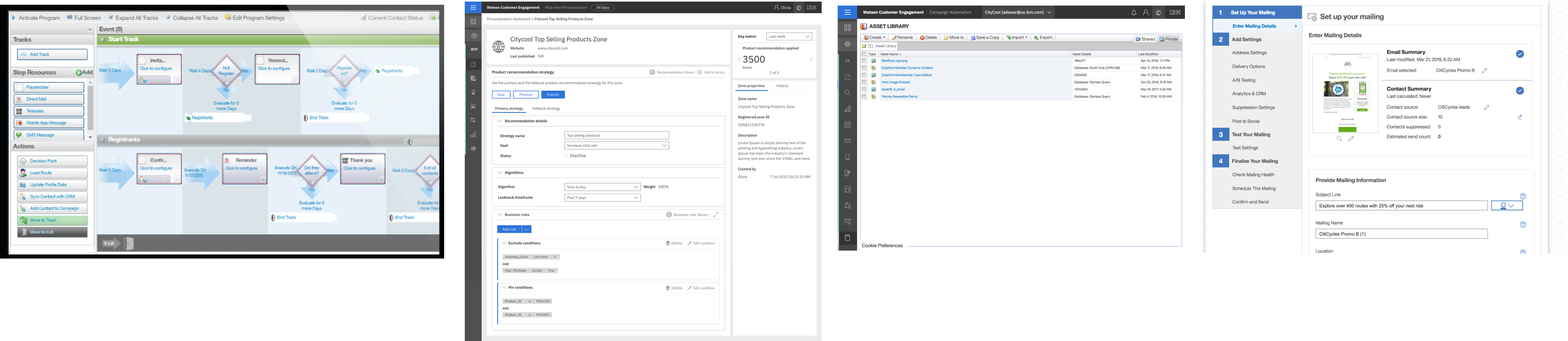
Phase 2: UX rewrite
Almost in parallel, we started redesigning every UI in our platform. We started with a sitemap to design the new information architecture for the platform. We also identified key workflows and sought to optimize the experience across the capabilities that comprised these flows. Systematically, we designed over 5000 new UI panels (pages, modals, actions) against an extremely accelerated timeline. As a team, we collaborated continually in order to ensure consistency of patterns across the platform and evolved the make-up of our design system in real-time. We also relied on user feedback, usage data and beta testing to inform our decisions.
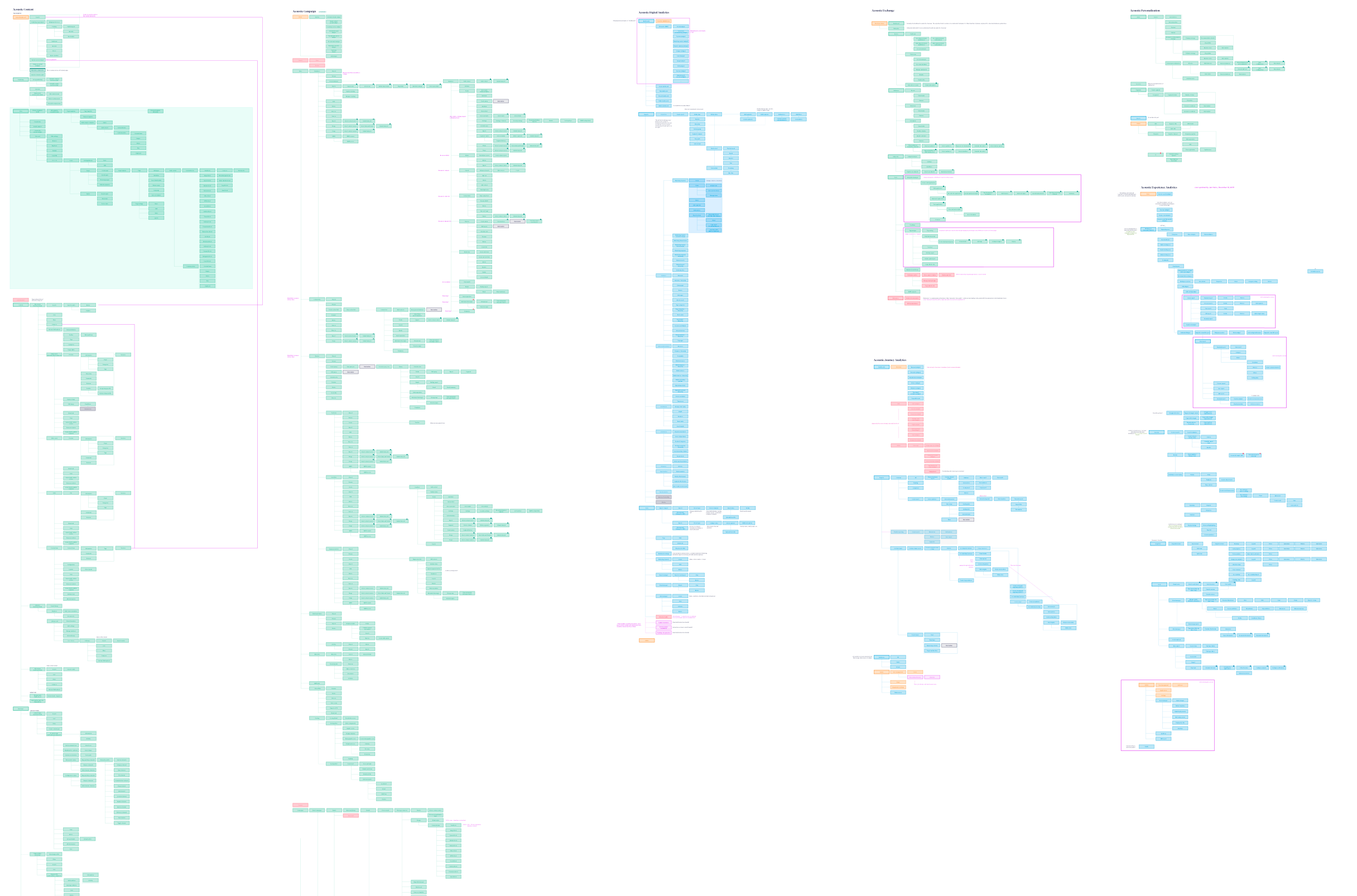
Acoustic platform sitemap
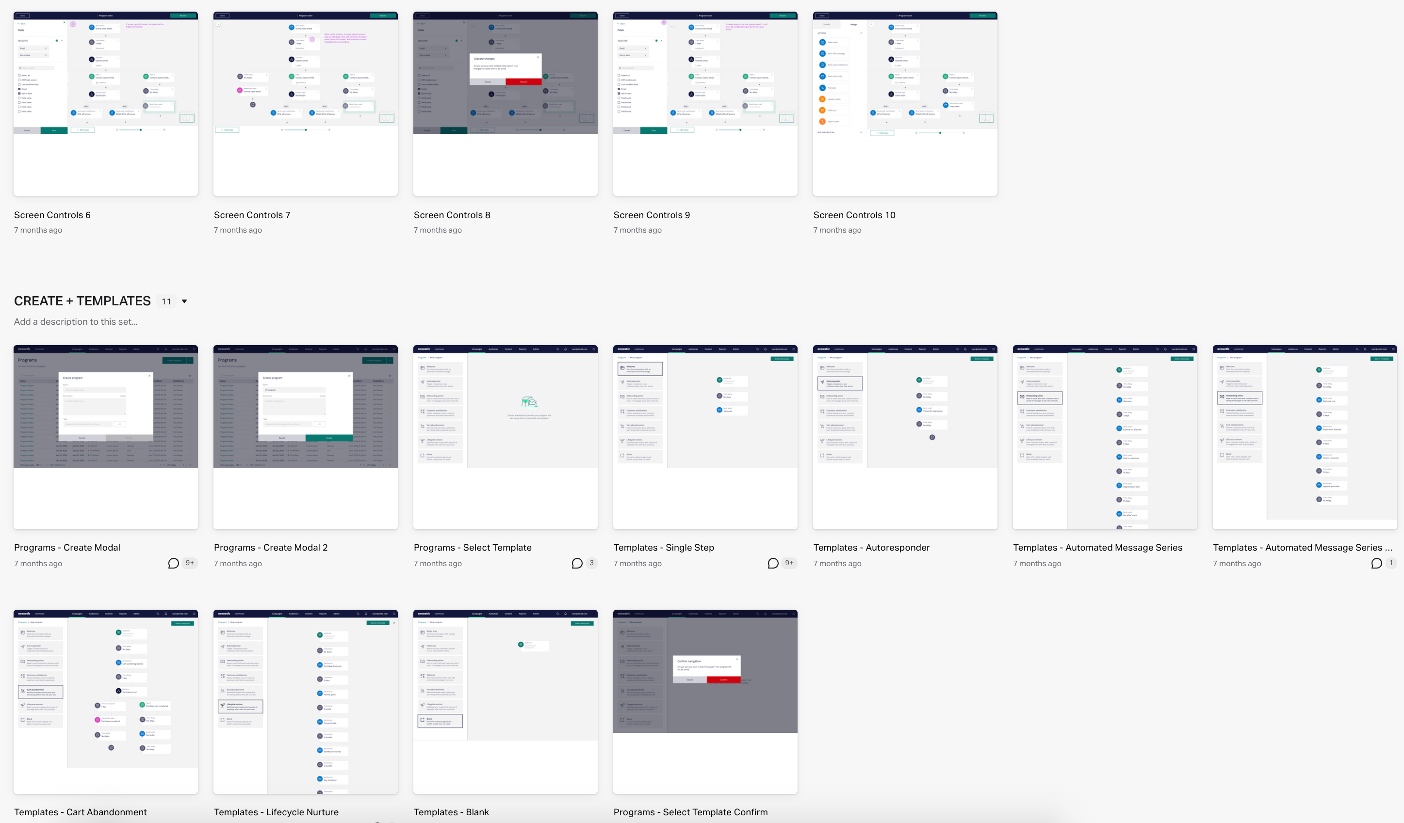
Example of end-to-end InVision board per Product
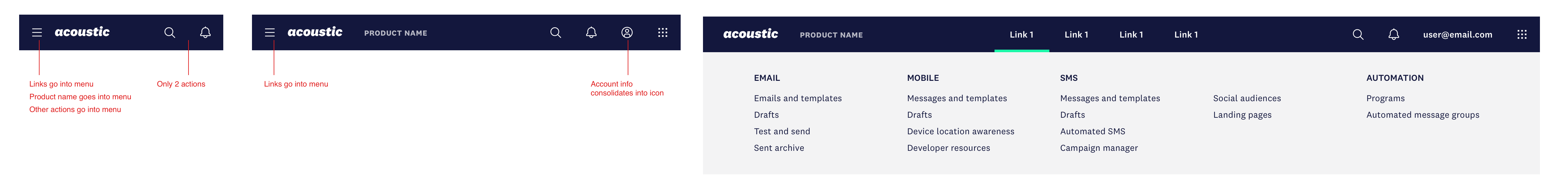
Updated navigation
Examples of updated page UI
End-to-end customer experience
Beyond the redesign of our software offerings, we knew it was important to deliver a first class customer expeirence including taking a fresh look at our product documentation, in-app nudges, and other channels where we regularly engaged our customers and prospective users. Our team delivered a brand new help center and developer experience, discussion forums, updated email templates, and a branded status page and ideas portal. Our goal, as the organization grows, is to drive more self-service support, as well as grow our community of users. We placed specific focus on consolidating, reorganizing, and rewriting our documentation to adopt a more “how to” format.
Acoustic help center + developer experience
Acoustic email templates
Real time feedback and analysis
As we went throught this process it was important for us to have as much near real-time feedback and insights into our customers’ use and experiences as possible. We developed an “all feedback” strategy that allowed us to collect input from a number of internal (and external) channels and customer interactions. We catalogued it, and then analyzed it for trends. It’s a living document that’s was organized in a manner that we could continually consult the data to understand users’ expectations for a given capability or function. This type of data was invaluable to our efforts and coupled with online user research, interviews, and customer focus groups, it has given us the confidence we needed to know our work had made a difference.